
Marina Makoeva
As part of the latest release for our iOS products and HQ Web Portal, we have overhauled the design (known as the User Interface Design (UI) and User Experience Design (UX)) to create a user experience that is intuitive and consistent across all products.
Before I explain why we have updated our UI/ UX - and what this means for our users - let me first introduce myself. I’m Marina Makoeva, the Lead UI/UX Designer at Mercaux; I have been with the company for 15 months now, based in the London office. I've been in design for 13 years, and for the past five years I've been working on interfaces. Several months ago I had a great opportunity to redesign Mercaux’s products.
Why have we updated the UI/ UX?
There were three main factors motivating our decision to update the UI/ UX in our latest product releases:
- Intuitive user experience and navigation
One of the biggest reasons for overhauling our UI was to ensure Mercaux’s products are intuitive and easy to use. Our latest product release includes new features designed to make Mercaux technology as user-friendly as possible, as well as tailored to the specific device you are using.
I’ll go into a bit more detail about these updates when discussing how these changes will affect the individual user, but, to quickly mention a couple of examples, we have enhanced our Web Portal UX by introducing intuitive features such as the ability to switch time-zones, or a dual navigation toolbar that allows users to easily switch between pages.
- Fast development and implementation of new designs
These updates have also coincided with the development of an exciting new UI Toolkit - a group of formalised "lego" pieces for our developers that will enable us to speed up the creation and implementation of new features.
Before the development of this Component Library, all of Mercaux’s products looked slightly different because they were created at different points in time, with different contexts and developments. But, with this new Component Library, we can make sure all products are coded in the same way. Our new Component Library will form the building blocks of future developments, containing ready-made elements and patterns that will simplify the design process. This means that, whenever we want to create a new screen or functionality, it will be easier to rapidly roll out across all Android, Web, or iOS devices.
- Visual consistency across all products
Another reason for overhauling the UI was that we wanted to achieve visual consistency across all of our products. Up until now, the Mercaux App has varied slightly across different devices. Although our products have always used the same signature colour code and many of the same graphics, our updated interface ensures that, no matter whether a user views our App on an iPhone, Android device, or our HQ Web Portal, the interface will look and ‘feel’ exactly the same. Moving between Mercaux products will be a seamless and familiar experience, with the same styles, navigation, and functionalities.
How will these changes affect users?
Now let’s discuss what the updated UI/ UX will mean in practice.
The biggest change for users will be in the Web Portal where we completely redesigned the structure and focused users’ attention on the main menu at the top – Content, Operations and Analytics. Each of the main menu sections is now split into sub-sections in the left menu and administrators’ settings, as well as personal settings which have been moved to the profile icon and gear icon on the right.
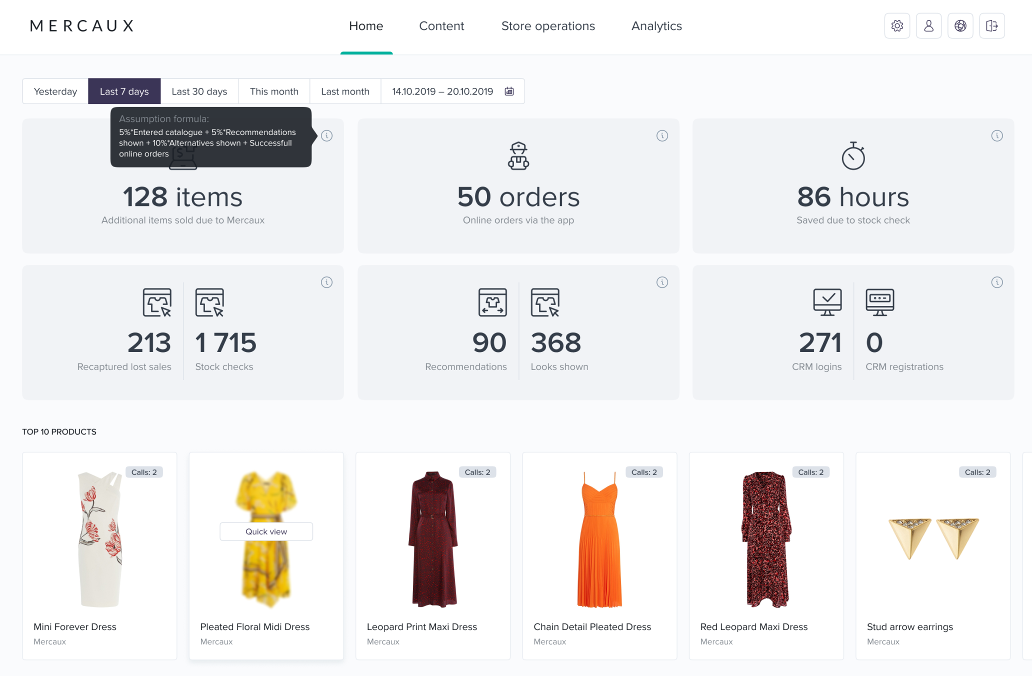
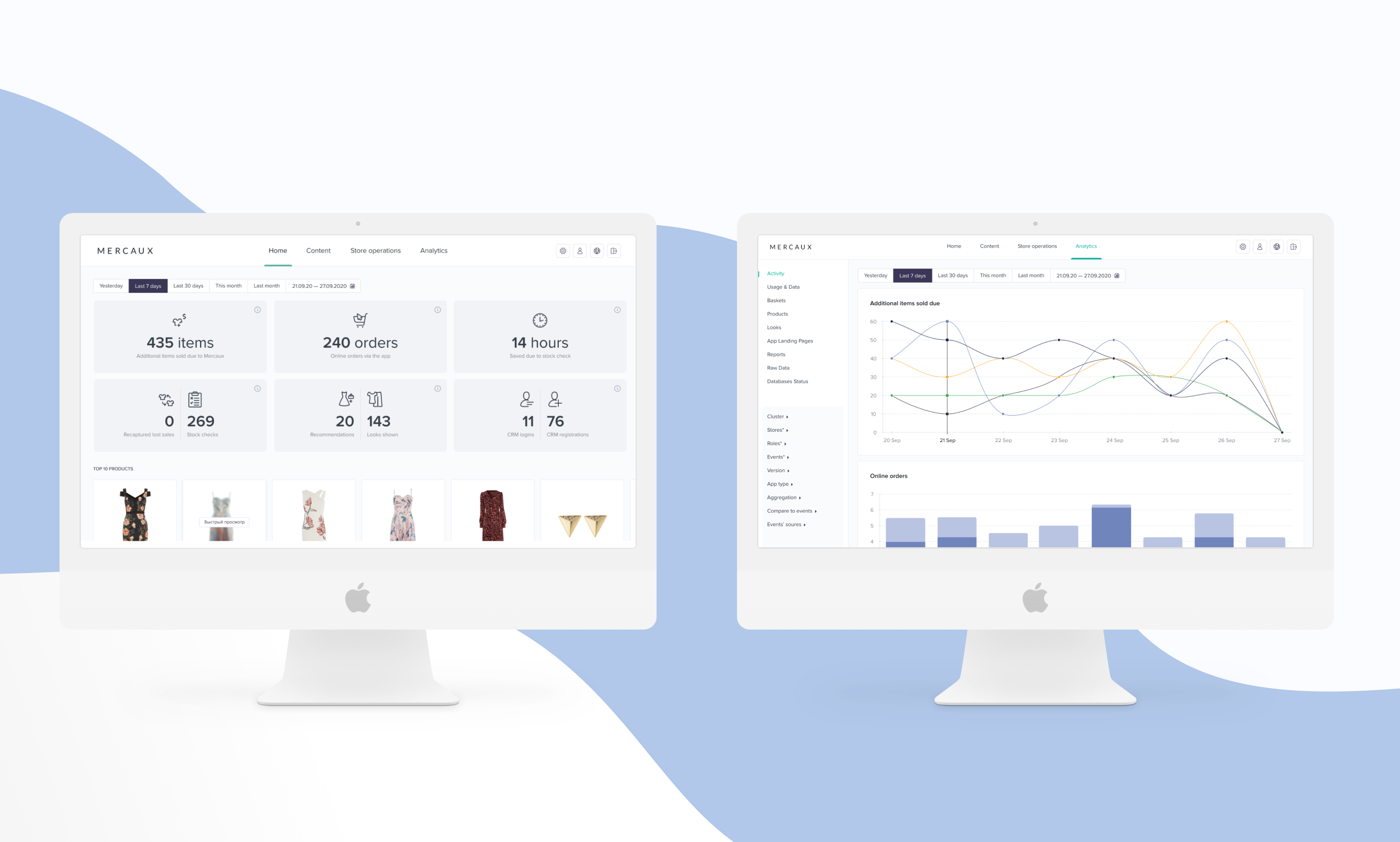
Updated Dashboard of Web Portal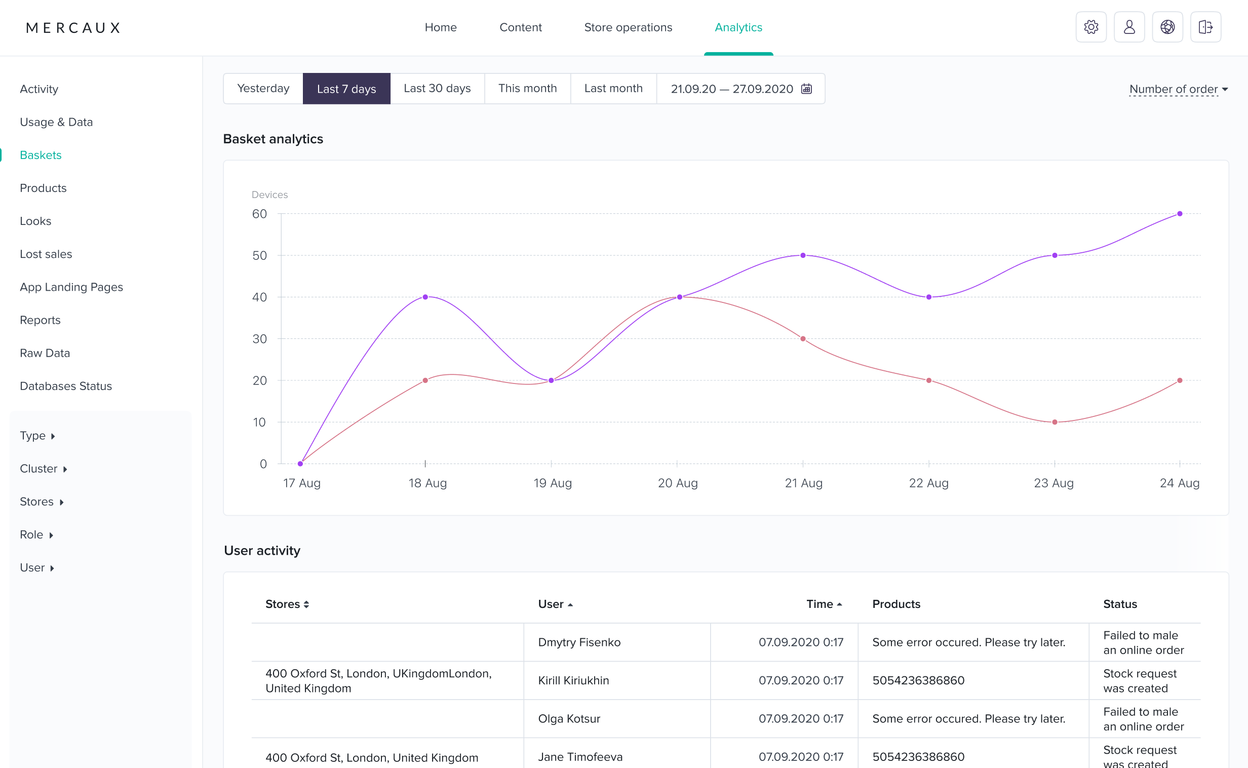
Updated Analytics Section of Web Portal
Our recent UI/ UX overhaul has also prompted us to look at making device-specific changes to ensure that the user experience is perfectly matched with the device you are using. Put simply, even though we have standardized the UI across all our products, we know that the features which make an excellent user experience on an iPad are different on an iPhone. Our commitment to improving user experience has led to a renewed focus on smaller devices, such as the iPhone and iPod Touch. In response to customer feedback on the popularity of hand-held devices, we have updated our iPhone UI so that, instead of treating the iPhone as a scaled-down version of the iPad, it now has device-specific UX developments such as compact product pages and a simplified on-screen catalogue.
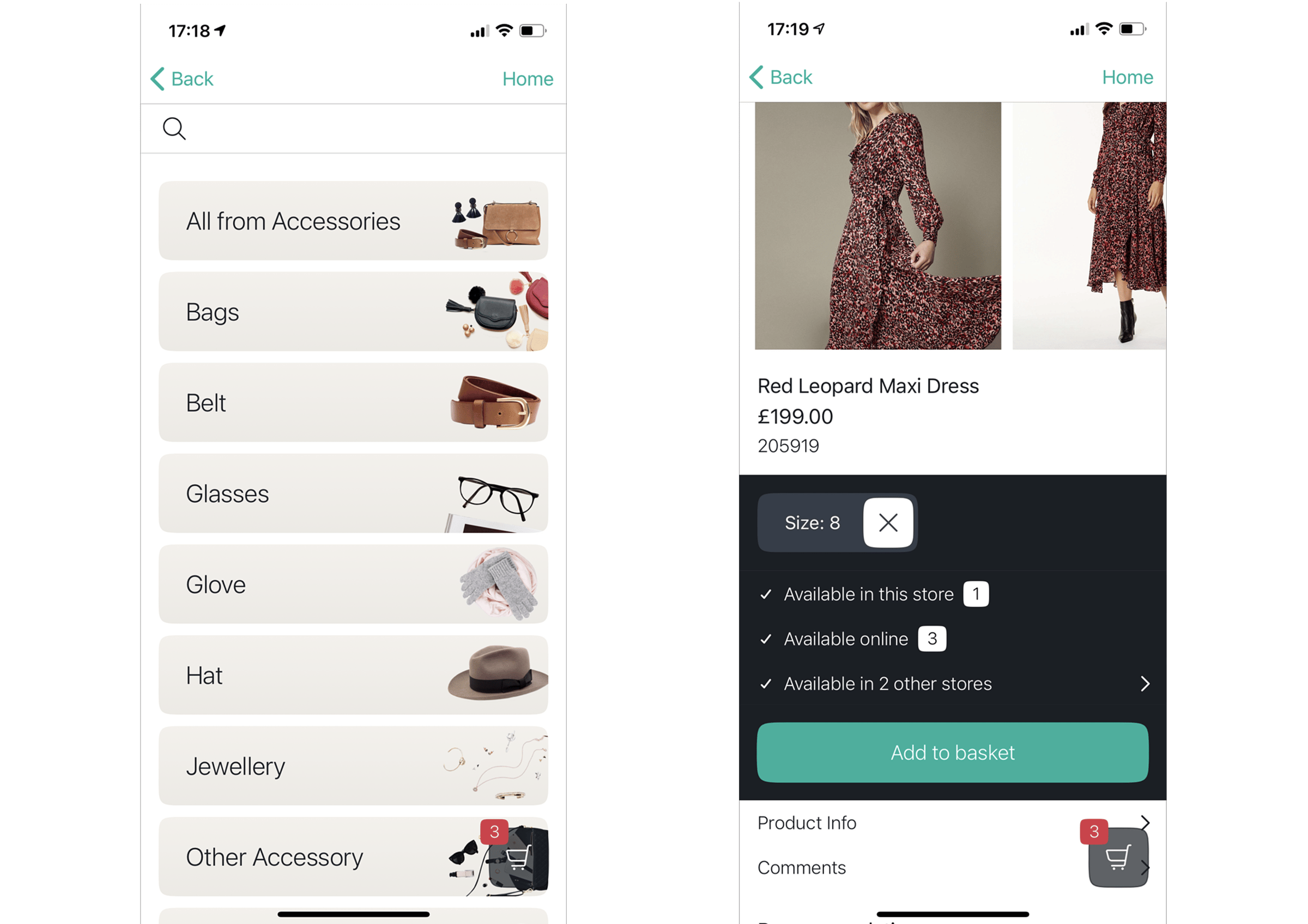
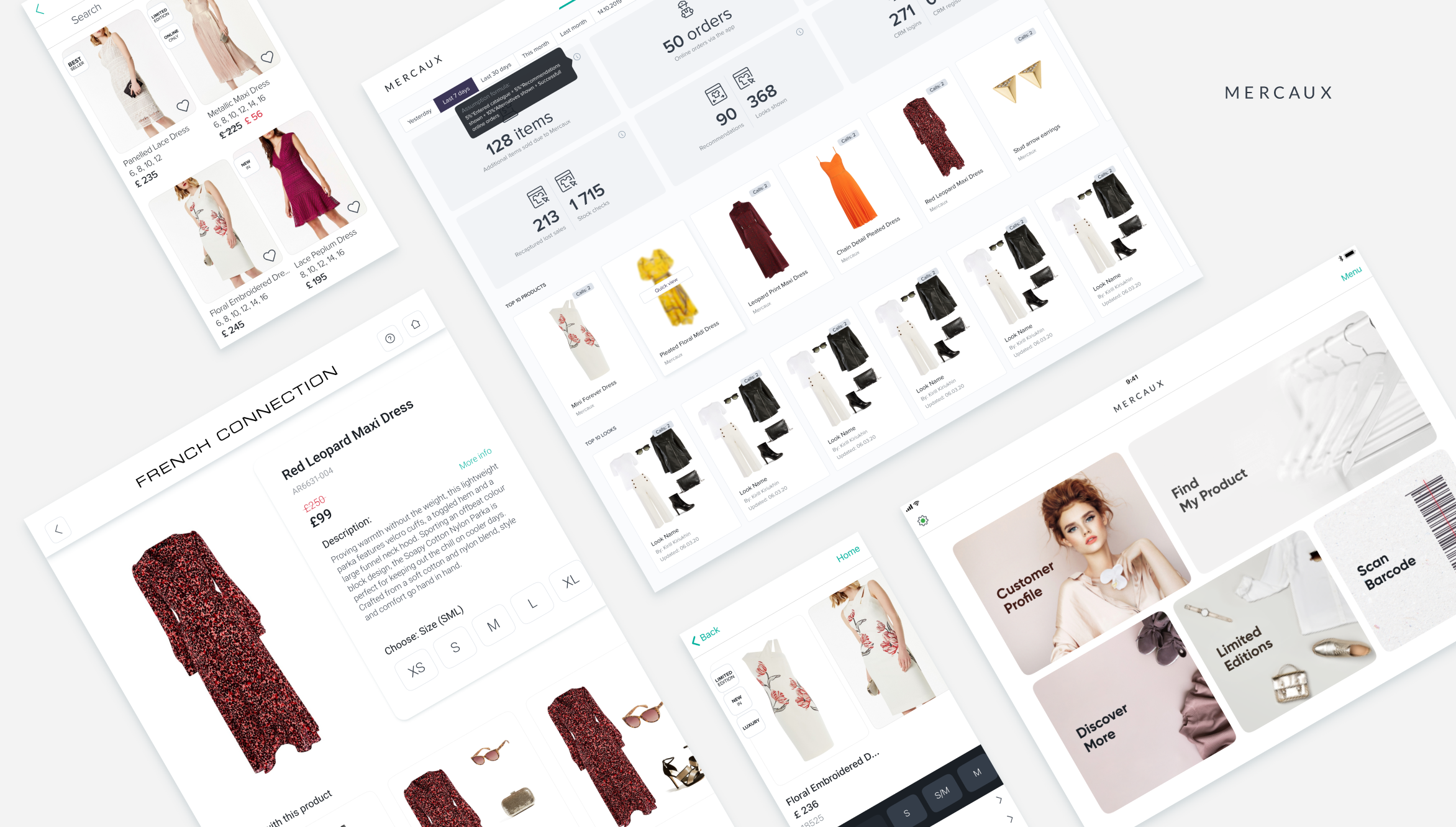
Simplified Catalogue Screen & Product Page
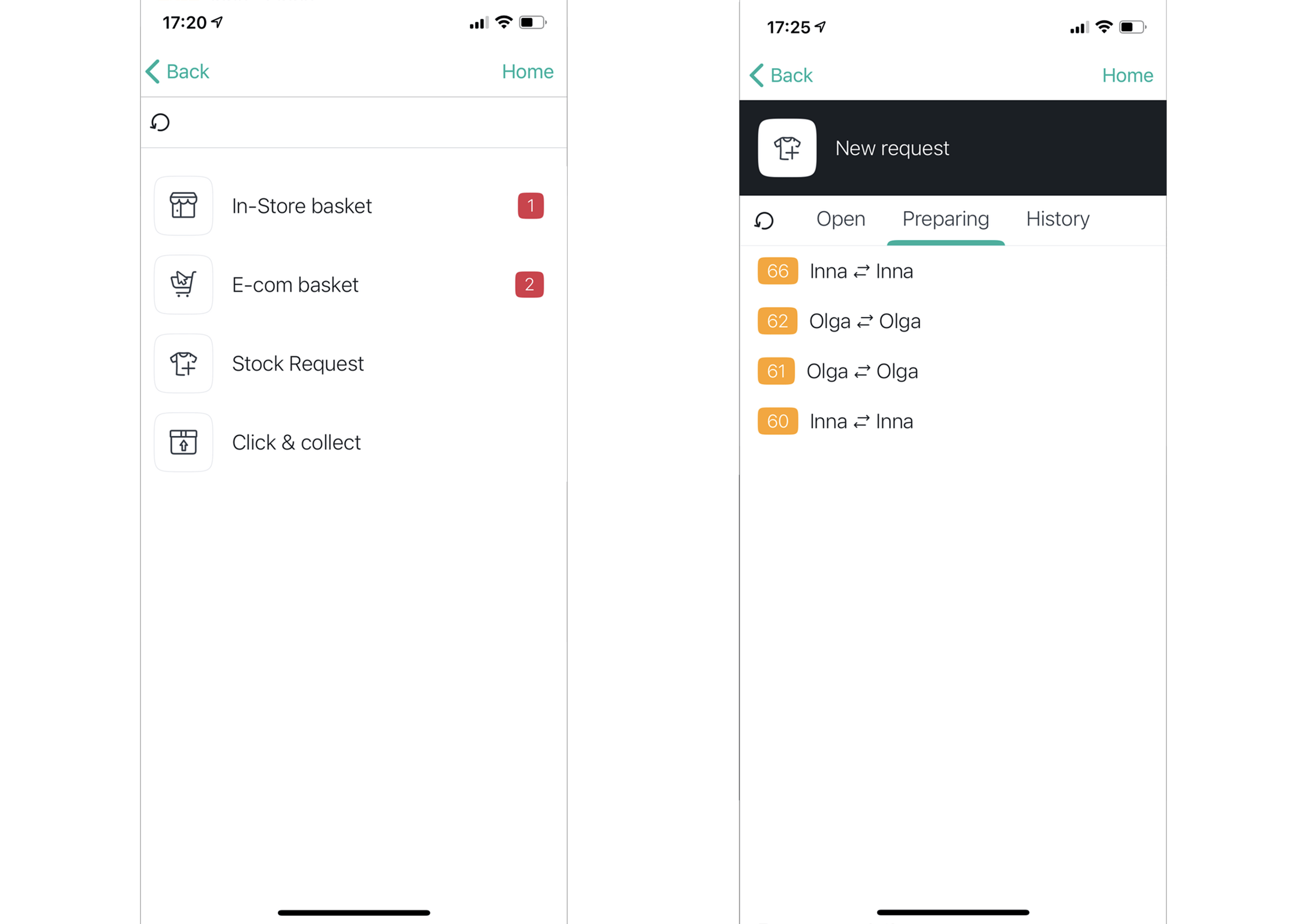
Another good example of an iPhone/iPad-specific UX change is basket navigation. Mercaux platform deals with a lot of different basket types such as in-store and online baskets, stock and Click&Collect request baskets as well as baskets shared between sales associates and self-service devices. The new navigation features now make it easier to find the one you are looking for as well as add products to the correct one.
Examples of Basket Navigation:
At Mercaux, we are constantly revising our products and designs as part of our ongoing commitment to help retailers create the store of the future. Please feel free to organise a demo or get in touch if you want to know more about our latest product features.